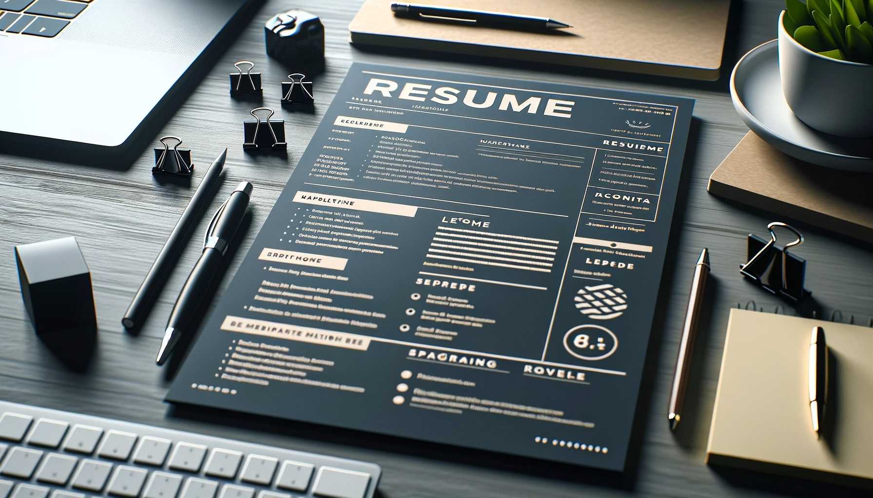
Formatting for Impact: Making Your Resume Shine Without Diamonds
Let's face it, a well-written resume is only half the battle. In today's competitive job market, a visually appealing and well-formatted resume is crucial for making that crucial first impression. After all, a hiring manager might only spend a few seconds scanning your document before deciding if you deserve a closer look.
So, how do we transform a boring text dump into a visually compelling document that screams professionalism? Buckle up, because we're about to dive into the world of resume formatting, where presentation meets practicality.
Choosing the Right Format:
There are three main resume formats: chronological, functional, and combination.
- Chronological Format: This is the most common format, showcasing your work experience in reverse chronological order, starting with your most recent position. It's ideal for candidates with a clear career progression and relevant experience for the desired role.
- Functional Format: This format focuses on skills and achievements rather than chronological work history. It's a good option for career changers or individuals with gaps in employment, allowing them to highlight transferable skills and accomplishments.
- Combination Format: This format blends elements of both chronological and functional formats, providing a balanced overview of your work experience and skillset. It works well for candidates with diverse experience or those wanting to emphasize specific skills relevant to the job.
Layout Tips for Maximum Impact:
- Margins: Maintain consistent margins (typically 1 inch) on all sides to create a clean and balanced look.
- Headings: Use clear and concise headings for each section (e.g., Contact Information, Experience, Skills). Consistent formatting with bold fonts helps guide the reader's eye.
- Whitespace: Don't underestimate the power of white space! Leave enough space between sections, lines of text, and bullet points to create a sense of breathability and improve readability.
- Font Choice: Stick to professional, easy-to-read fonts like Arial, Calibri, or Times New Roman. Avoid fancy fonts or excessive font sizes that might appear distracting.
- Bullet Points: Use consistent bullet points throughout your resume. Hyphens or dashes can also work, but maintain consistency for a clean look.
White Space Utilization: Your Secret Weapon
White space isn't wasted space; it's your secret weapon for creating a visually appealing resume. Here's how to use it effectively:
- Section Spacing: Leave a slightly larger space between sections (e.g., Contact Information and Experience) to visually differentiate them.
- Line Spacing: Don't cram too much information onto one page. Single or 1.15 line spacing ensures readability and prevents a cluttered look.
- Margins: Utilize margins strategically. Maintain consistent margins on all sides to frame your content and prevent information from bleeding to the edges.
Remember: Your resume should be visually balanced. Break up large blocks of text with bullet points, headings, and white space. A well-formatted resume is easier to read and navigate, making a positive first impression on the hiring manager.
Bonus Tip: Consistency is Key
Maintain consistent formatting throughout your entire resume. This includes font size, font type, spacing, and bullet points. Consistency creates a sense of professionalism and makes your document easier to process for the reader.
Beyond the Basics: Advanced Formatting Techniques for a Standout Resume
While mastering the fundamental formatting principles is essential, there are additional techniques you can leverage to elevate your resume and truly grab the hiring manager's attention:
- Strategic Use of Bolding and Italics: Highlight crucial information like your name, job title, or specific achievements with bold text. Use italics sparingly, perhaps for website URLs or book titles.
- Power of Headers and Subheaders: Don't just rely on bold text for section headings. Consider using larger font sizes or slightly different font styles (e.g., bold and italic) for main headers, and smaller bold fonts for subheaders within sections (e.g., under "Experience"). This creates a hierarchical structure that guides the reader's eye.
- Visual Cues (Used Wisely): A splash of color can add personality, especially for creative fields. However, use color sparingly and strategically. Consider colored section headings or subtle borders to enhance visual appeal without appearing distracting.
- Leveraging Icons (But Not Overdoing It): Small icons can add visual interest and save space, especially for highlighting skills like software proficiency or communication tools. However, avoid using too many icons as they can clutter your resume.
- Length Matters (But It's Not One-Size-Fits-All): There's no magic number for resume length. Ideally, aim for one to two pages, depending on your experience level. For entry-level positions, one page is often sufficient. If you have extensive experience, consider a concise two-page document, prioritizing the most relevant information.
Tailoring for Online Platforms:
Many companies utilize online application portals. While formatting might slightly differ, here are some key points to remember:
- Use Resume Templates (With Caution): Many online platforms offer resume templates. These can be a great starting point but remember to customize them to fit your needs. Don't let the template dictate the content or formatting.
- Save Your Resume in the Right Format: Most online portals accept PDFs or .docx files. Ensure your resume is saved in a format that won't lose its formatting during uploading.
- Preview Before Submitting: Always take a moment to preview your resume after uploading it to the online platform. This ensures the formatting hasn't been disrupted and everything appears as intended.
Why a Great Cover Letter is Key to Landing a Job at Good Companies
The Fusion of Tech and Talent: How Latest Technological Advancements Are Shaping Resume Writing
The Final Word: Formatting for Impact
Formatting your resume is an art, not just a technical exercise. By going beyond the basics and utilizing these advanced techniques, you can create a visually appealing and informative document that showcases your skills and achievements in a way that truly captivates the reader. Remember, a well-formatted resume is a powerful tool that can help you stand out from the competition and land that dream job.


